The design of an Internet site is often key in determining its success, the user experience and the response achieved. If a page is overloaded with information or graphics, it causes confusion and can even discourage visitors. Web designers and graphic artists are constantly developing new ways of ensuring websites achieve a modern look. Flat design is currently still in the lead. But Google’s latest interesting introduction is making web designers sit up and listen…
What is flat design and what are its characteristics?
Flat design is widely popular, likely due to the fact that it generally refrains from using exaggerated design elements, instead focusing on strong typefaces, powerful typography as a design means and the rejection of complex graphics. Its origins can be traced back to app development. Flat design is notable particularly for its absence of textures. Simple graphic elements, the absence of shading and 2D views do a convincing job. Complemented by pleasing and soft colours, flat design creates appealing and attractive websites. Just imagine an app blinking incessantly with graphics and images: would you enjoy this? The same question is relevant when it comes to designing professional websites.
What is the particular advantage of flat design in the field of web design?
Our blog has previously tackled the subject of responsive design. Nowadays search engines as well as users expect a website to operate seamlessly on any device – including mobile ones. This is where conventional websites hit a hurdle: complex graphics, strong graphic depth and different design levels make mobile viewing difficult. Flat design provides an elegant solution: the responsive design is simplified. Working with clear structures and contours – rather than three-dimensional levels – facilitates the step towards responsive web design.
But what is material design by Google?
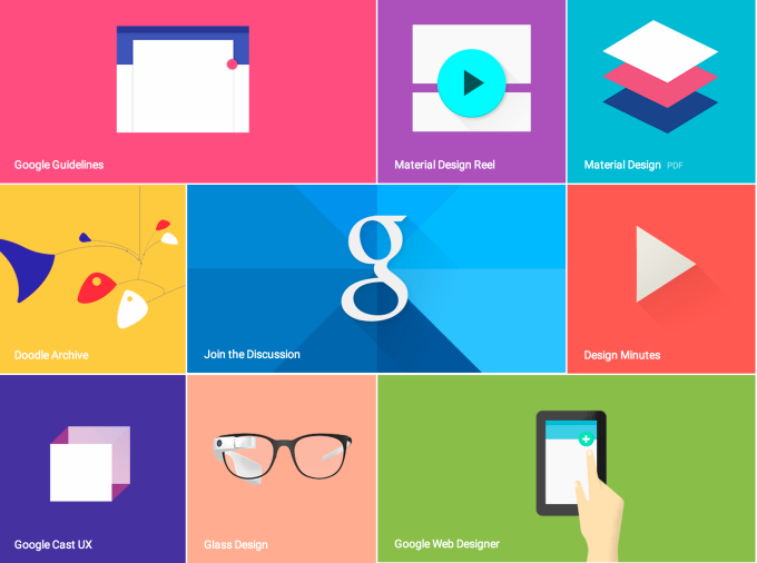
The announcement of Android “L” was accompanied by a concept that seared itself into the minds of designers: material design. Google plans to use material design in all its software and applications. The scale of this is worth pointing out: this is not just a new design form, but a complete design language, which goes beyond devices and applications. A design language guided by the look and feel of magazines. Classic, appealing, simplified. The field of application is vast: Chrome OS, browser apps, Android Auto, Android Wear and any media created by Google. An example of this can already be seen in the structure and style of Google+ profiles. In summary, material design is Google’s own design language, signalling competition to flat design.

What is the objective of material design?
The objective is for a good design to provide users with a higher level of usability and an improved user experience. Concepts from the world of content marketing are combined with the design: in future website or app users are guided intuitively by an informative design. This intuitive navigation leads to an improved and more authentic operation of all application areas.
We will be eagerly following the development of material design and look forward to keeping you updated in further blog posts.


